


The Nokia design team has created a new user interface design language called Pure UI. This is, of course, intended for use with Nokia phones, but it can also be used with all sorts of other Nokia products.
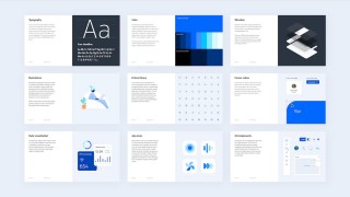
The design is meant to be consistent, flexible, and future-proof, with a clean, minimal look that is a major design trend today. There are multiple components, starting with templates and guidelines.
A major part of the new look is the Nokia Pure typeface used throughout the UI.
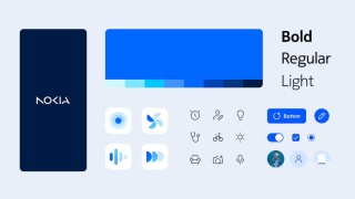
Nokia Pure typeface
New icons for Pure have also been designed. They are based on strokes, the thickness of which can be changed to suit the display requirements and capabilities of a particular device. It also includes smooth animations when a particular component should grab the user’s attention.
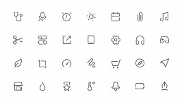
Nokia Pure Icons are based on geometric shapes
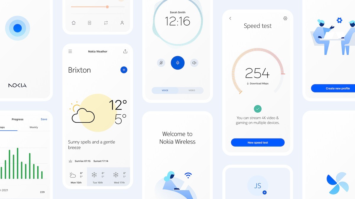
The Nokia team has also provided standard elements that designers can use to quickly create screens with a consistent look.


App screens have a consistent look thanks to Pure Illustrations.
Of course, dark mode is supported, and elements and icons are styled accordingly.
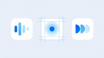
Nokia Pure icon and dark mode support
So far, Nokia’s phones have come close to the standard Android look, but we should see some movement towards adopting Pure UI. yeah.
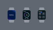


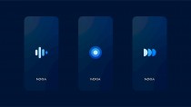
Nokia Pure is suitable for all kinds of displays
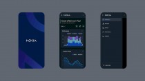
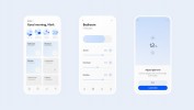
Again, this is used on other devices as well as mobile phones. Nokia Pure UI has powerful components that can be used, for example, to build complex web-based dashboards. The interface is designed to scale from small wrist-worn displays to large wall-mounted panels.


Build complex and information-rich dashboards with Nokia Pure UI
For more information on the new interface, visit the NokiaPure.com page.
via